For a long time, photographing architecture with a Lensbaby lens has been on my creative wishlist. Typically, these lenses are used for nature and portrait photography, and I’ve always admired the dreamy, soft-focus effect they create. I first became fascinated by them through macro flower photography, especially the work of Anne Belmont—if you haven’t seen her photos, go check them out, they’re stunning.
But what exactly do these lenses do? To me, they evoke a sense of the imperfections seen in homemade cameras, like pinhole cameras, with their light leaks, lack of focus, and whimsical, distorted edges. They create this ethereal, almost surreal perspective with soft focus and bokeh effects that feel like a dream.
I haven’t come across many people using them for architecture, so I thought, why not experiment? During my LA workshop, I decided to take the plunge and shoot only with the Velvet 85mm lens. Big thanks to one of my attendees for lending me theirs for the day! It was a fun challenge, pushing me to look for shots that weren’t so tightly focused on specific details, but rather showed a bit more of the environment and context. I found that these shots highlighted the lens’ unique effect much better.
I’m still unsure if this style will create something radically different from my usual architectural work, but I’m seriously considering buying this lens to explore more. I’ve been in a bit of a creative slump, and sometimes, a change in equipment is all it takes to spark new ideas. Who knows where it will lead? But honestly, that’s part of the fun—experimenting, trying new things, and seeing what works (and what doesn’t).
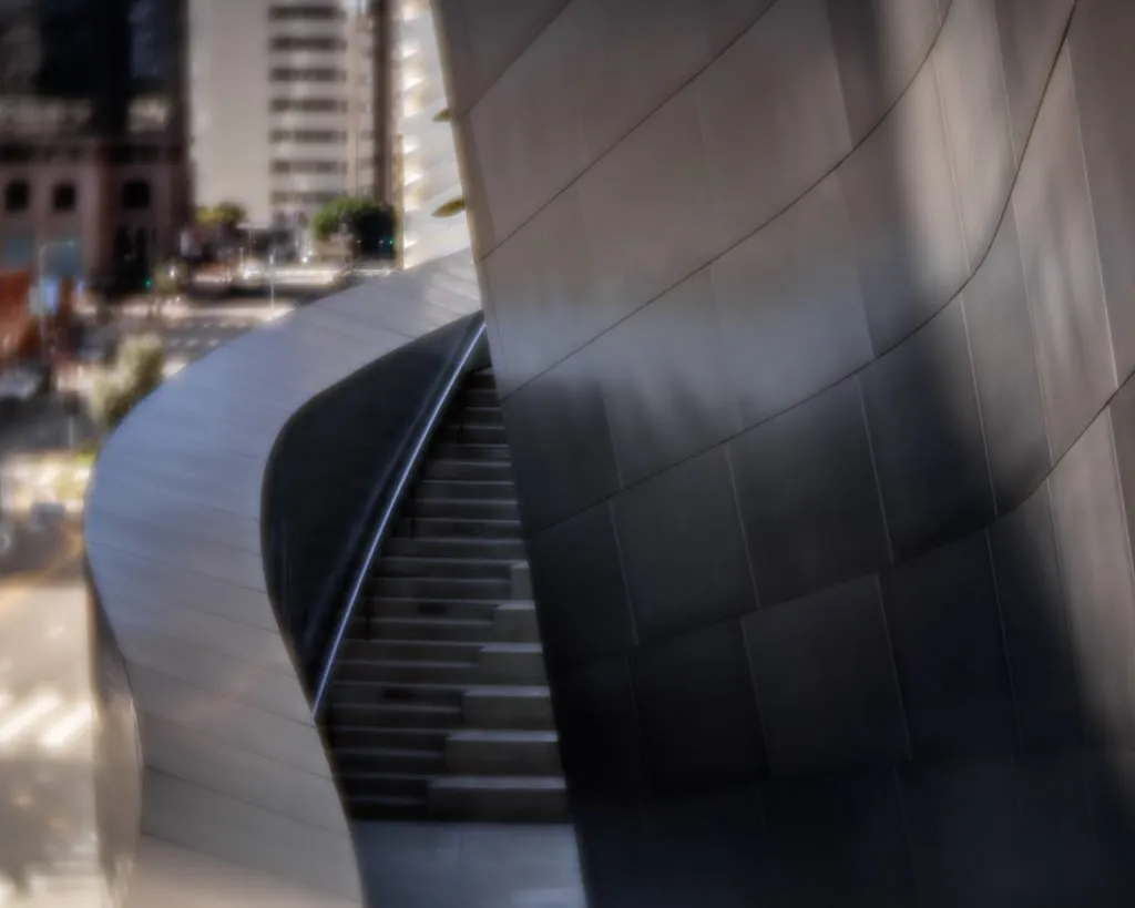
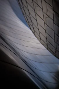
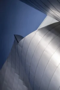
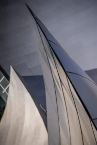
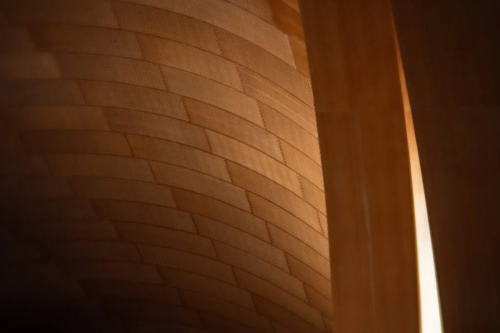
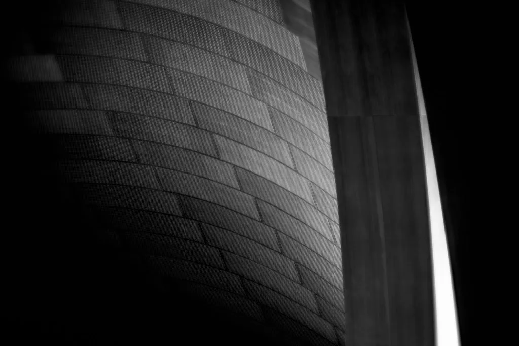
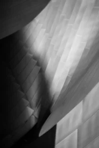
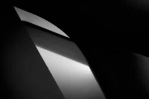
Here are a few of my favorite shots from the day. First up is the iconic Walt Disney Concert Hall. I edited both color and black-and-white versions, though I’m partial to the color shots here, especially the contrast between soft blues and warm golden tones. But I’ll leave it to you to decide which version resonates more.
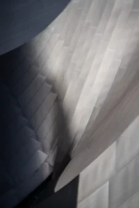
I only took one shot that I ended up liking. The colors don’t quite match the exteriors, so I think for the sake of cohesion, I would go with black and white for the series.
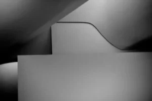
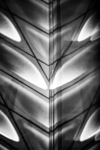
Now, for B&W. Working our way backwards.
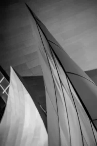
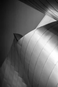
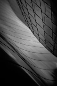
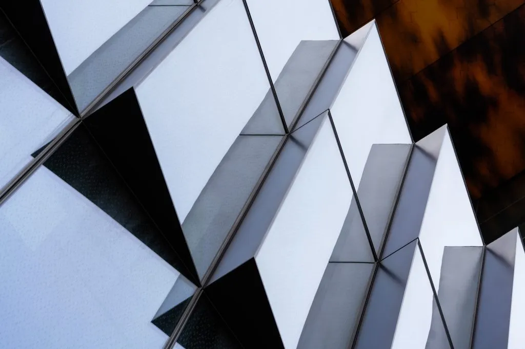
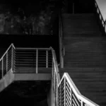
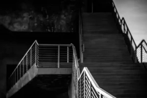
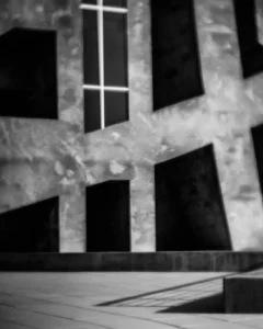
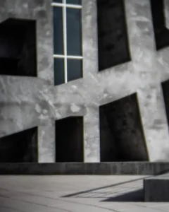
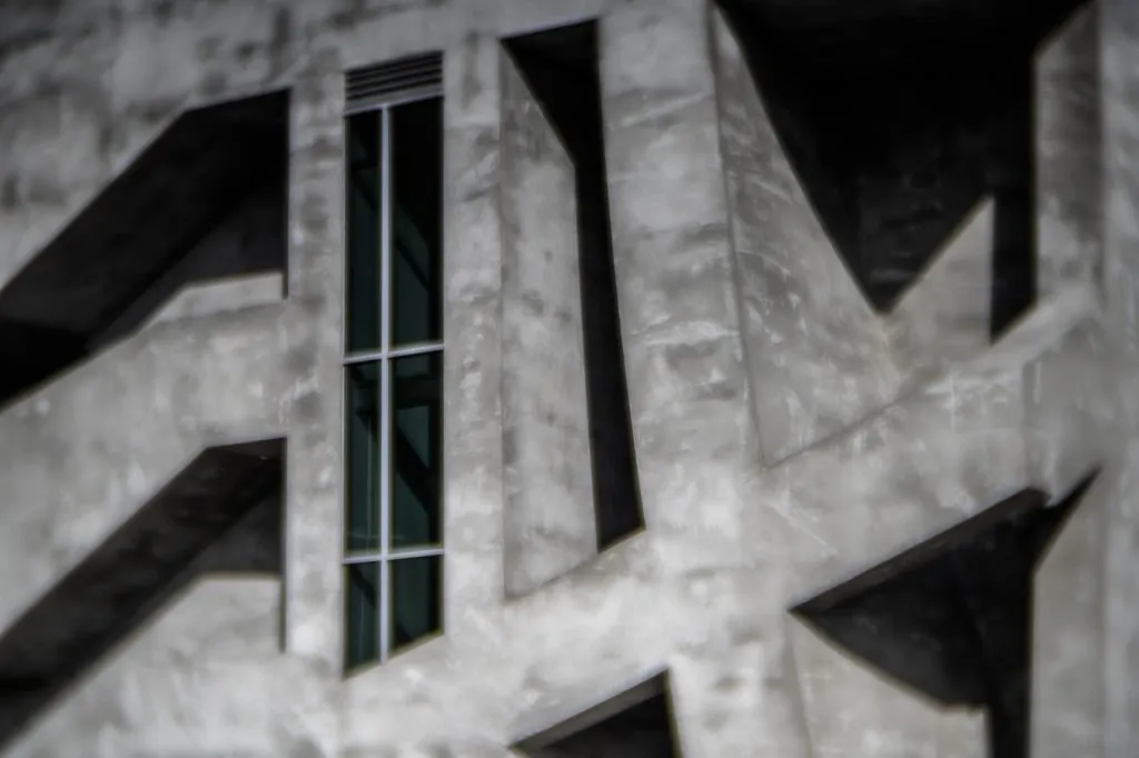
Onto, the neighboring Broad Museum. Here, I only made shots inside the museum. All but one, I edited only in B&W.
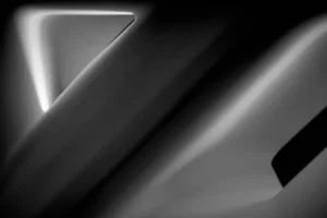
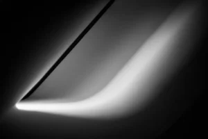

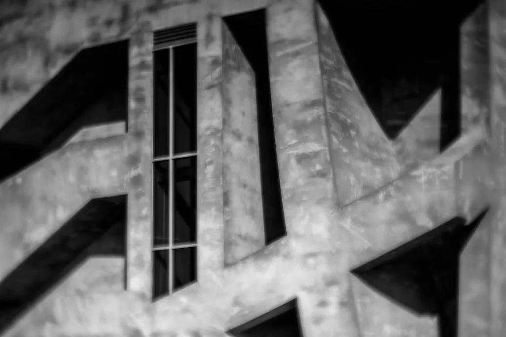
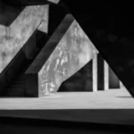
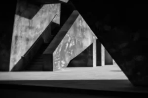
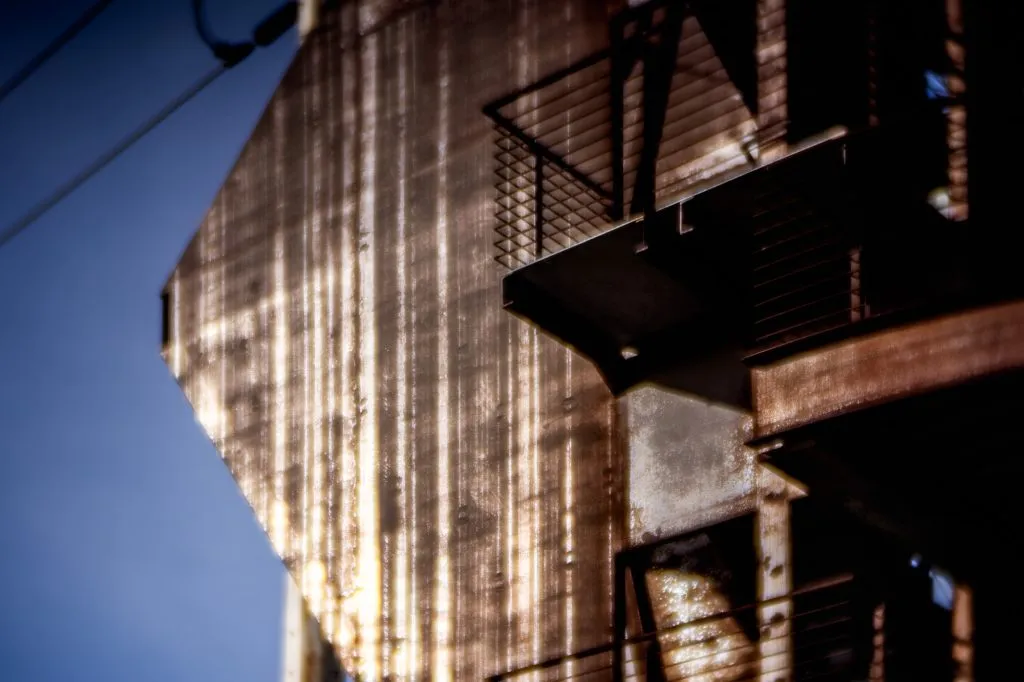
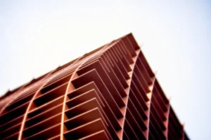
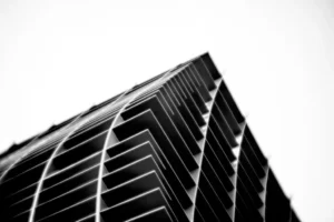
The remaining shots were taken in Culver City, with most of them captured at The Wrapper Building. Both color and black-and-white versions were made. There’s something about the buildings here that gives off a dystopian feel, especially The Wrapper. It’s all about the raw concrete and the chaotic design. Whether in color or B&W, there’s this consistent monochromatic, muted tone to it all.
Only one shot of Samitaur was taken. The rusty tones of the structure against the clear blue sky made the color version stand out as the better choice.
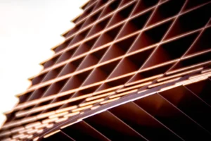
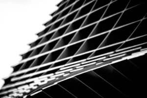
Lastly, The Waffle Building. The bold orange is impossible to ignore, yet there’s something captivating about the patterns in black and white as well.
That’s what I’ve put together so far. I’d love to hear your feedback. The 85mm has its limitations with its fixed focal length, but I actually enjoy working within constraints. If I get a Lensbaby, I’ll start with this and see where it takes me.